Problem:
The current VOEBB.de website for Berlin’s public libraries suffers from outdated design, inefficient search functionality, and a convoluted navigation structure. These issues hinder users’ ability to quickly access library services, locate branch-specific information, and discover lesser-known features like digital services and streaming.
I see this as an opportunity to explore ways to enhance Berlin’s public libraries (VOEBB). Approaching this from a UI/UX designer’s perspective allows me to focus on improving the user experience and making the service more effective and engaging.
Goal:
A modernized, user-friendly design that:
1. Enhances task efficiency (e.g., searching, reserving,…).
2. Improves accessibility and navigation for diverse user groups.
3. Promotes underutilized features (e.g., movie streaming, Library of Things).
Project overview
Role: UI/ UX Researcher & Designer
Duration: 4 weeks
Tools Figma
DISCOVER
I began by conducting user interviews to gain a deeper understanding of the users’ pain points, I conducted interviews with 10 users. The questions are created to gather insights about: Usage Patterns and Devices, What Users Already Like about the website, current Pain Points, Accessibility, Navigation, Design Preferences and other Feedback.
How often do you use the library’s website, and what are your primary reasons for visiting it?
What devices do you typically use to access the website (e.g., desktop, mobile, tablet)?
What do you like most about the library’s website? Why?
Are there any parts of the website that feel particularly easy or enjoyable to use?
Have you experienced any difficulties while using the website? Can you describe them?
Are there any features or sections of the website that you find confusing or hard to use?
Are you able to easily find the information you need? If not, what gets in the way?
How does the website perform on mobile devices? Is it easy to use?
How easy is it to find what you’re looking for on the website?
Have you ever struggled to locate specific resources or services? If so, which ones?
What do you think of the overall look and feel of the website?
What do you wish the website could do that it currently doesn’t?
Key insights from the interview:
• The website must cater to both regular and occasional users, offering a better experience on both mobile and desktop platforms.
• Core functionalities such as search, preordering, and membership renewal are appreciated but need refinement to become more user-friendly.
• Key user tasks, such as searching, navigating, and paying fees, are hindered by outdated functionality and design.
• Accessibility features need to be tested and enhanced to cater to a broader user base, including those with disabilities.
The website does not effectively promote its diverse offerings, limiting users’ awareness and engagement with library resources.
• A functional, streamlined design that clearly communicates information is more important to users than a purely aesthetic update. Users are seeking a more intuitive, dynamic, and feature-rich website that matches or exceeds the usability of other library platforms.
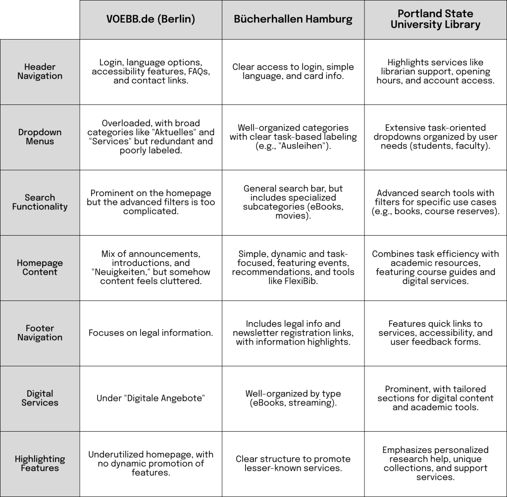
Comparative Analysis
VOEBB.de vs. Bücherhallen Hamburg vs. Portland State University Library
Analyzing the website structures of the Berlin Public Library (VOEBB.de), Bücherhallen Hamburg, and the Portland State University Library highlights differences in usability, navigation logic, and feature discoverability. Each structure has strengths that can inform an improved design for VOEBB.de.
DEFINE
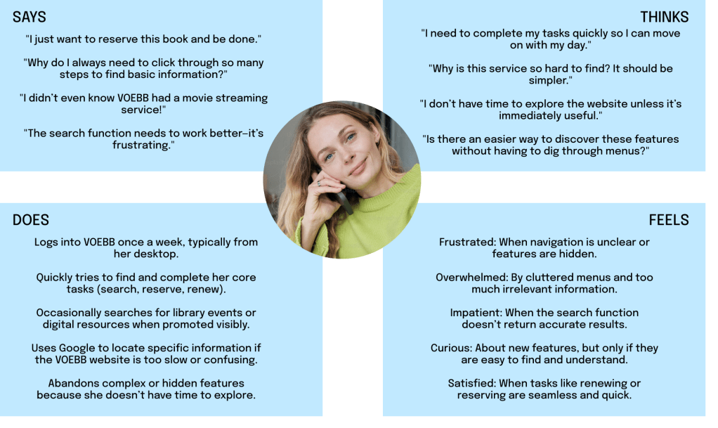
Using the insights gathered from the interviews and comparative analysis, I developed a user persona and empathy map for VOEBB.de.
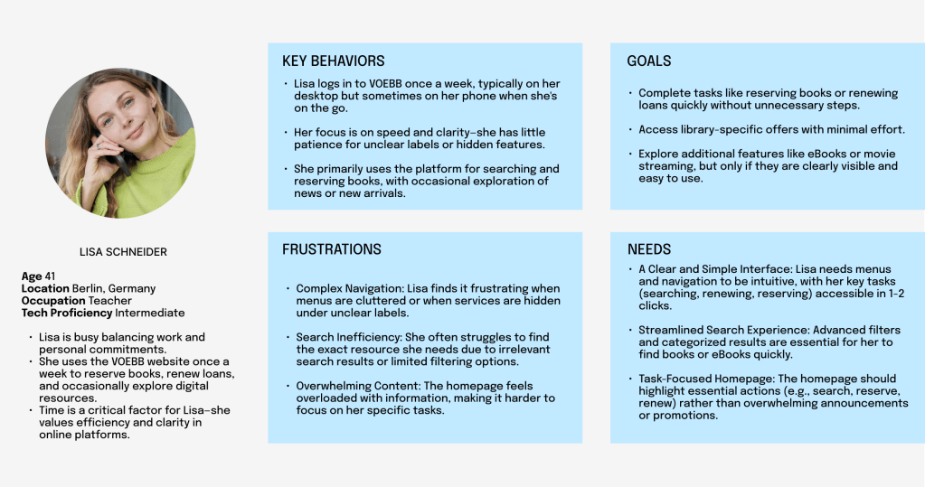
Lisa is a time-sensitive, task-oriented user who values efficiency and simplicity in digital experiences. VOEBB’s redesign must prioritize her key actions (search, reserve, renew) while subtly introducing her to additional features.
User Journey for Lisa Schneider with the Current VOEBB Website
This user journey maps Lisa’s experience as she interacts with the current VOEBB website to complete her primary task: reserving a book at a nearby library. It highlights her actions, emotions, and pain points at each stage.
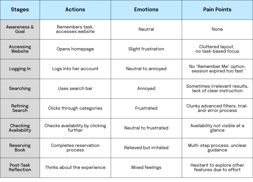
Opportunities for Improvement
- Homepage: Focus on essential tasks (e.g., search, reserve, renew) with clear CTAs and minimal clutter.
- Search Filters: Enable users to refine results by library location, media type, and availability.
- Quick Availability Display: Show branch-specific availability directly in search results.
- Simplified Reservation Process: Reduce the number of steps if possible and provide clear guidance with confirmation messages.
- Promote Features: Highlight other services (eBooks, streaming) subtly during the primary task flow.
By addressing these issues, the VOEBB website can better meet Lisa’s expectations for efficiency, clarity, and usability.
Conclusion from the Discover and Define Phases:
Since this is an existing website with an established user base, most users have no issues with the aesthetic design as long as the website remains clear and easy to navigate. Therefore, I plan to retain most the current UI design to minimize engineering effort, focusing instead on enhancing the user experience (UX).
IDEATE
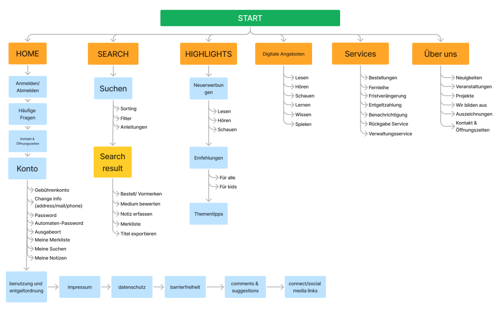
Information architecture
I utilized the card sorting method and decided to rearrange some sections of the website while ensuring that all necessary information remains intact. Since this is a redesign, I avoided removing any content, as I cannot definitively determine what is essential or dispensable. However, I conducted thorough research on similar websites and developed the best possible information architecture for VOEBB.
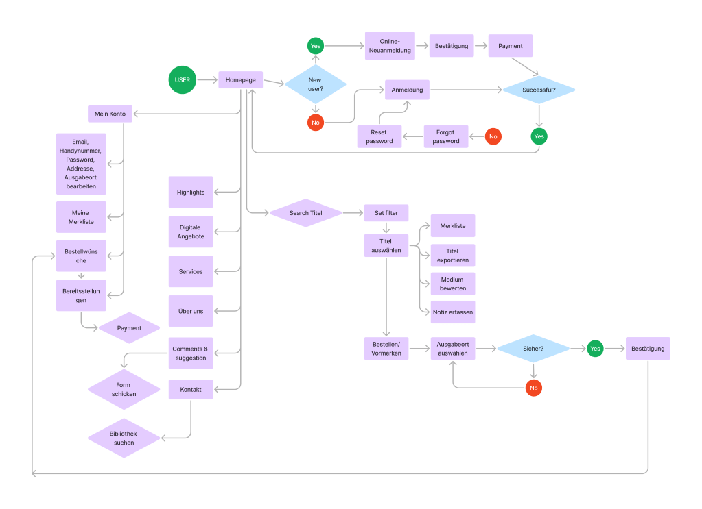
User flow
I created a user flow to establish a foundation for identifying which functions to improve. My primary focus is on the Log In and Registration processes, account management and orders, digital offerings, and most importantly, the search functionality.
DESIGN
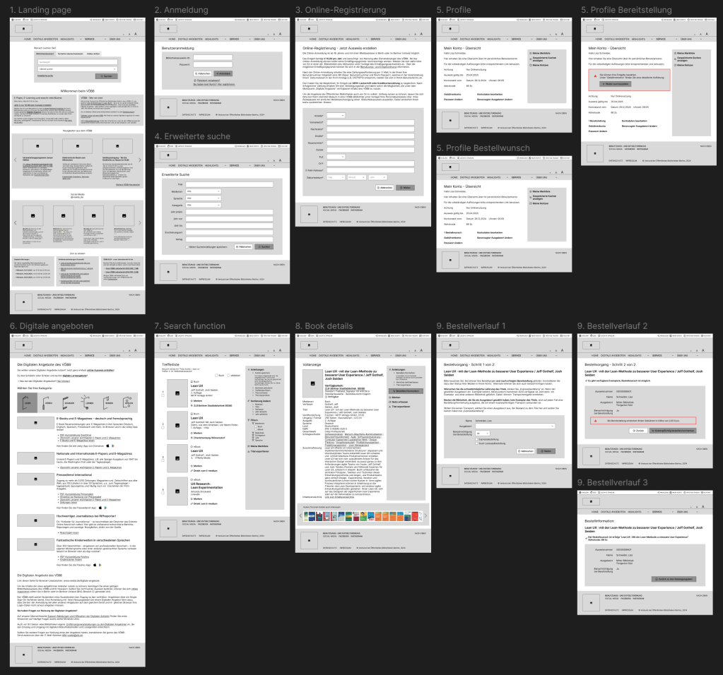
Lo-fi prototype
The black-and-white low-fidelity prototypes were designed based on the existing UI/UX, incorporating improvements from my perspective. I focused on recreating only the necessary screens and will provide a detailed explanation of the changes when discussing the high-fidelity prototypes.
Hi-fi prototype and redesigns
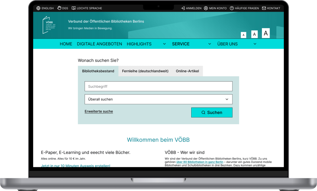
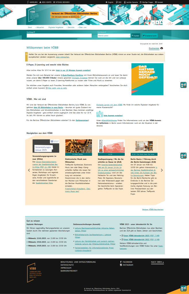
Before diving into my high-fidelity prototype, let’s examine the original VOEBB.de website. Through my research and comparative analysis, I found that while the website is not overly complicated compared to standard library websites, its menus and navigation are overwhelming, presenting too much information at once. Additionally, the outdated illustrations hinder users from easily accessing the necessary information.
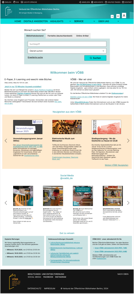
My New Landing Page:
Here’s what I updated:
• I replaced the illustration with a simple colored background to emphasize the logo and text.
• The dropdown menu was reorganized, bringing “Digitale Angeboten” to focus for better visibility.
• The search function now has a prominent position in the middle of the page, followed by an introduction to VOEBB.
• I retained the news section and footer with only some adjustments to create a more logical structure.
• Additionally, I included an Instagram widget to make it easier for users to connect with VOEBB’s social media team.
Basic Function:
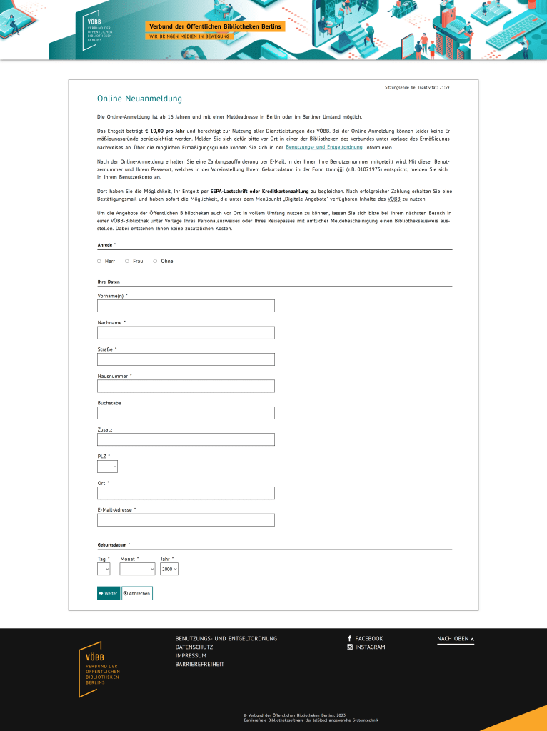
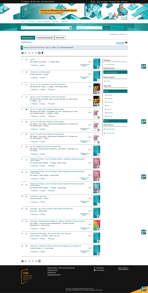
The previous extensive search page contained an overwhelming amount of unnecessary information.
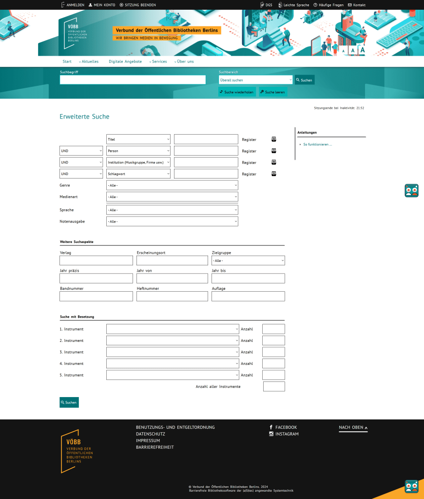
Current VOEBB page
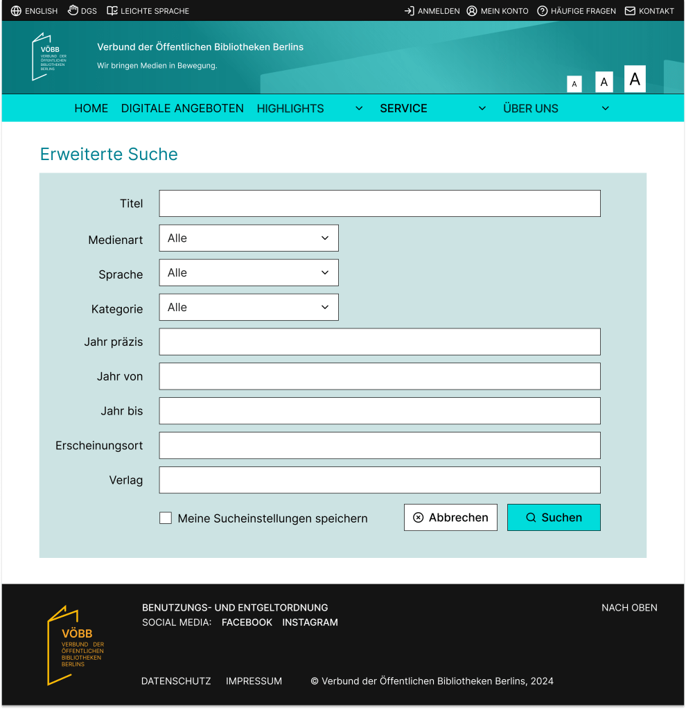
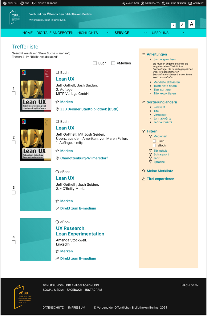
In my redesigned extensive search page, I simplified the filters, focusing only on the most important ones to ensure a clearer and more user-friendly experience.
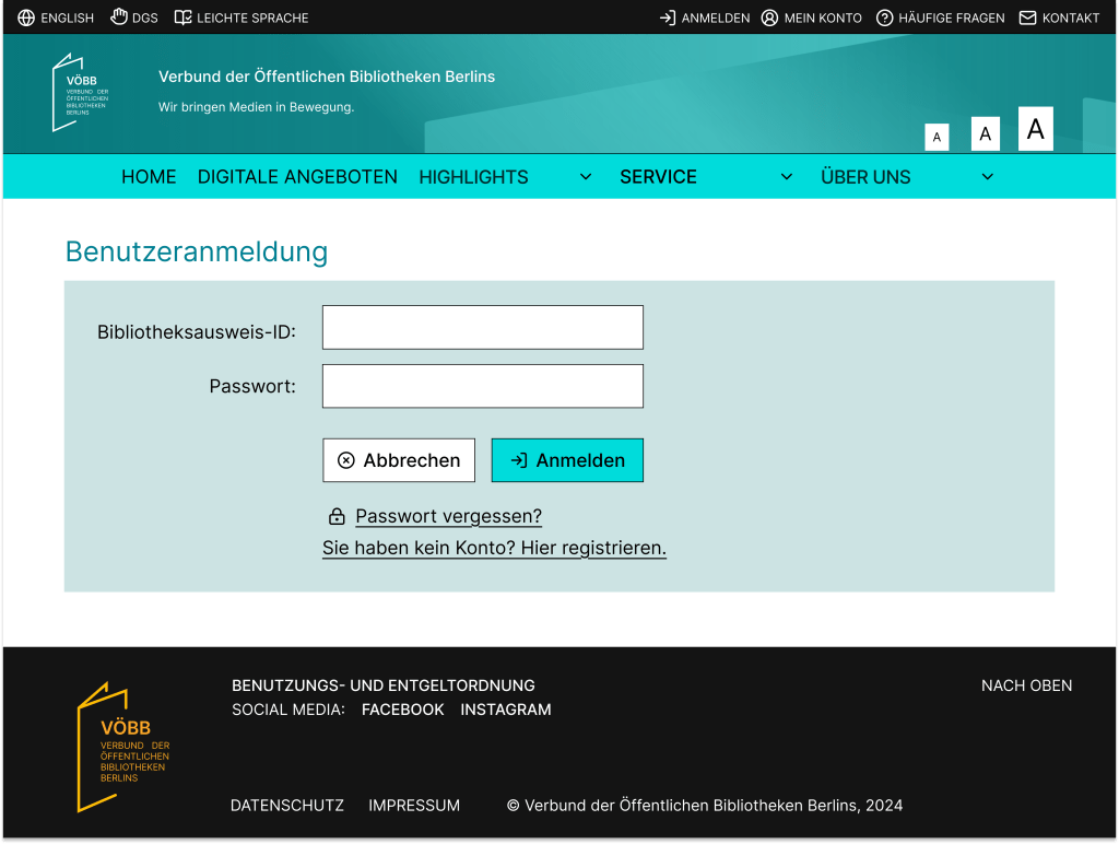
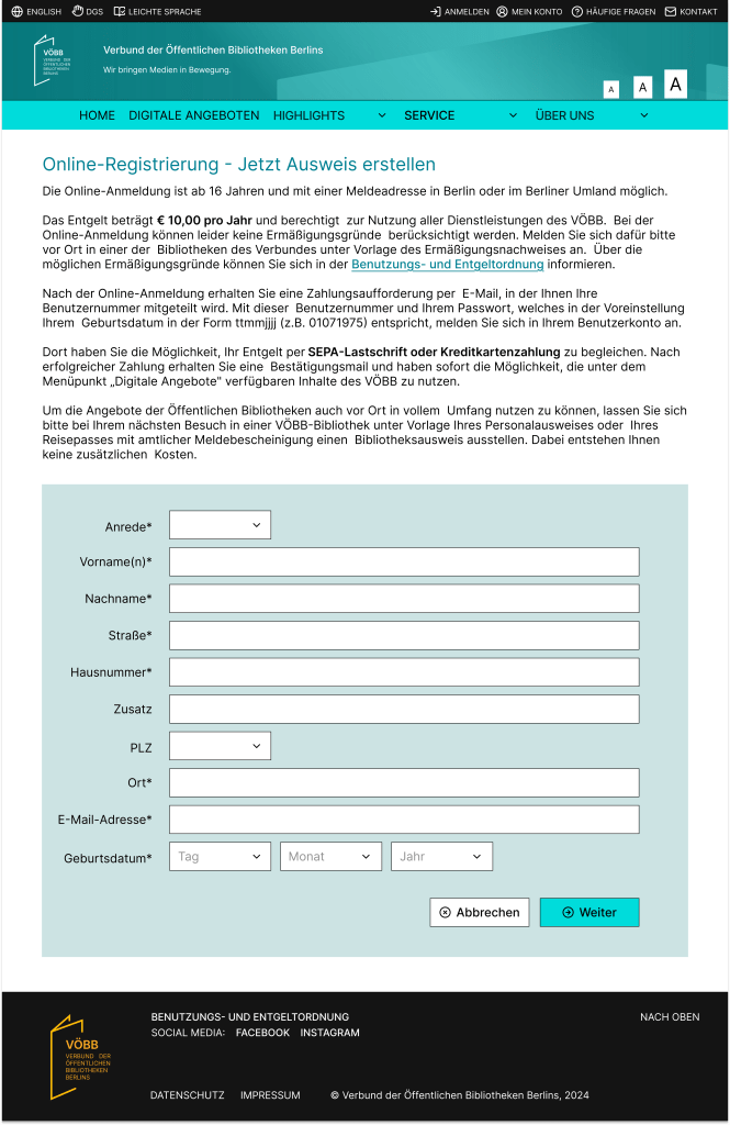
I found the Log In and Account Creation pages to have sufficient information, so I chose to retain their content.

Current VOEBB page
Current VOEBB page
The changes I made focus on enhancing the user experience by adjusting button placement and improving the UI to align better with the overall branding.
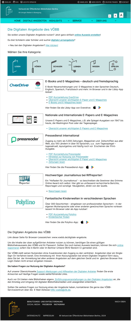
The current Digitale Angeboten page already provides sufficient information, so my focus was on enhancing the UI to make each category more distinct and visually appealing.
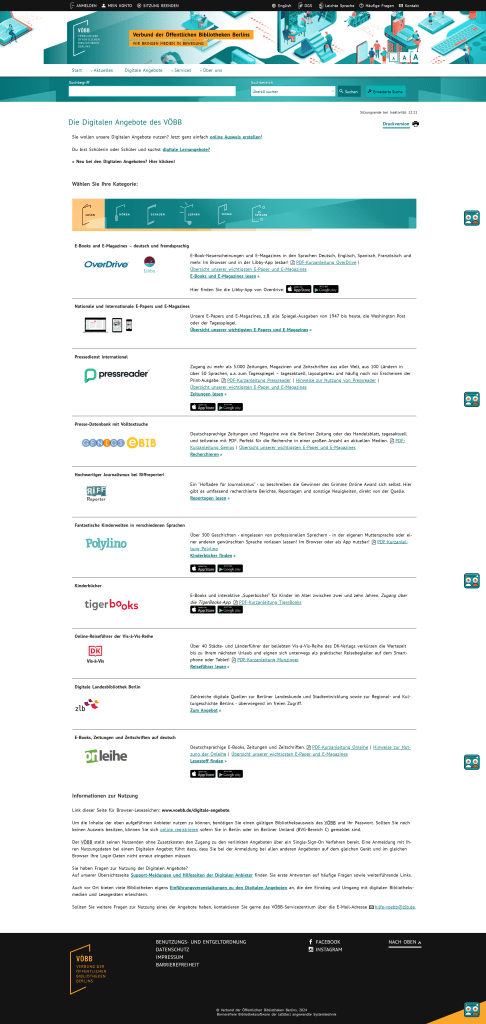
Current VOEBB page
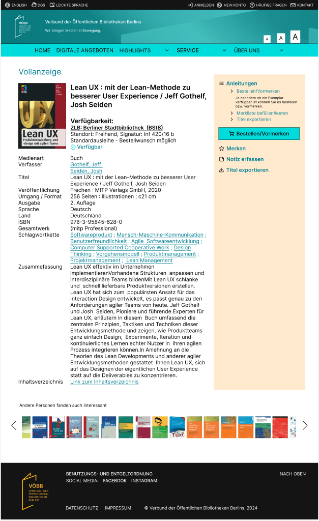
Search function and item details
Since I integrated the categories (Bibliotheksbestand, Fernleihe, Online-Artikel) into the search function on the landing page, the results page is designed to display results specific to the selected category. To enhance usability, I retained the most important features while simplifying the filters on the right, making navigation more straightforward. I also highlighted the book covers to create a more engaging experience for users.
Current VOEBB page
In the media details section, I displayed the availability directly beneath the media title, and the order button is prominently highlighted for better user visibility.
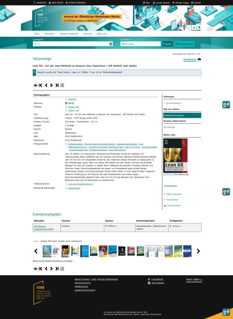
Current VOEBB page
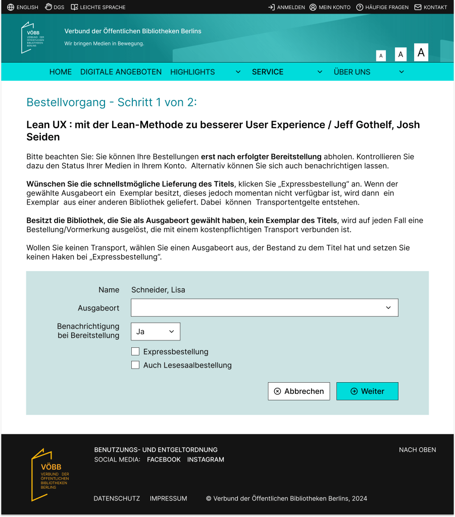
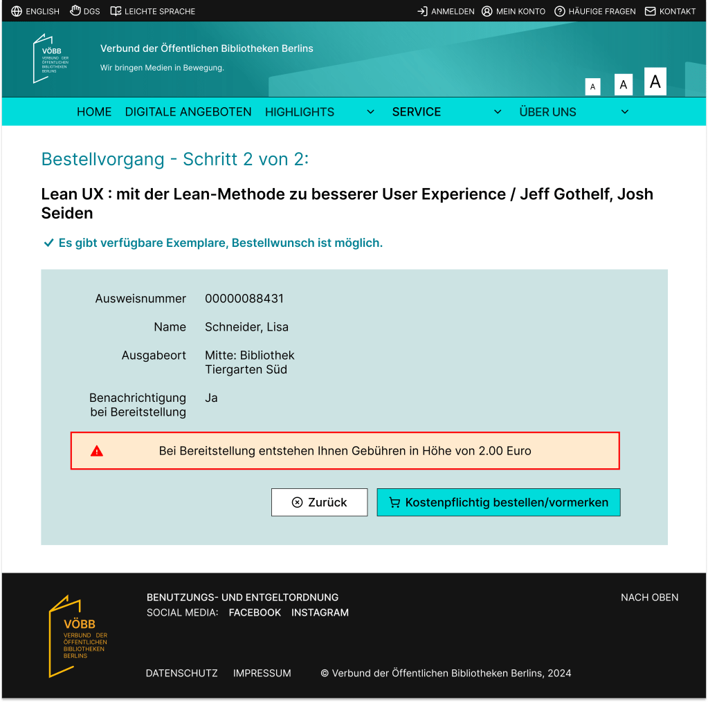
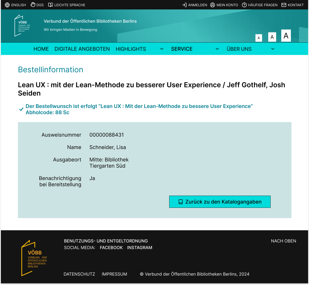
Ordering process
The ordering process remains largely unchanged from the current system, with only minor UI and UX improvements. I wanted to ensure the compliance with potential legal requirements and retains all necessary information. By keeping the existing steps intact, I focused on enhancing the user experience to make the process more seamless and enjoyable.
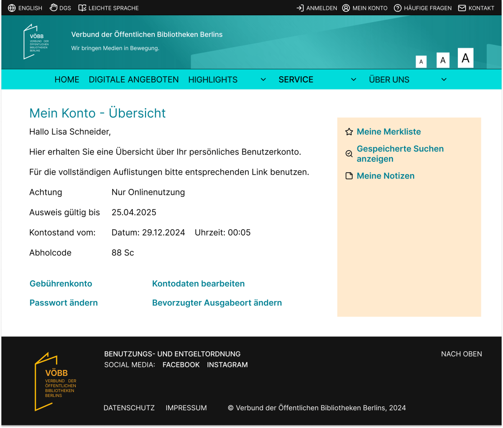
My Account
My Account maintains a consistent UI with the rest of the pages while preserving all the information provided by the current VOEBB account page. With the improved UI/UX, the buttons are now more visually distinct and easier to recognize.
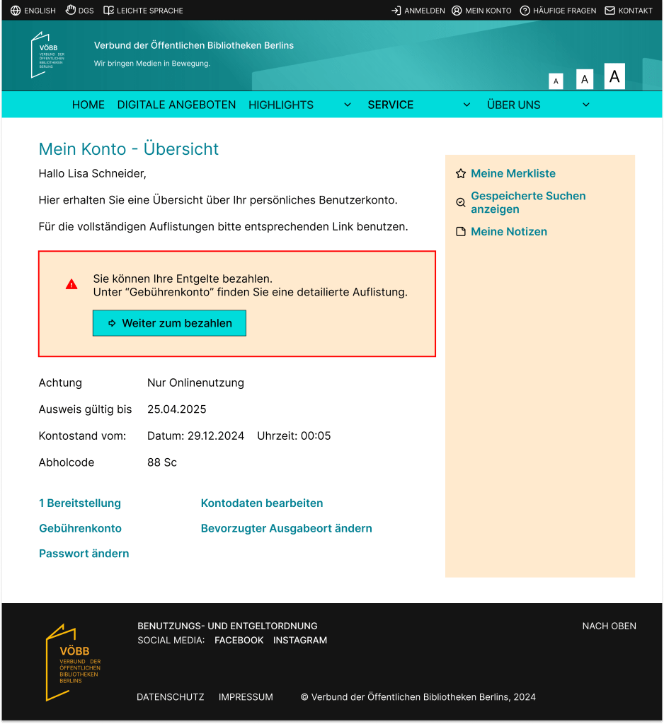
My account page after ordered a media:

My account page after the media has arrived and user needs to pay the fee:
CONCLUSION
Through user research, I identified key pain points, defined user needs, and developed solutions to address the challenges.
The result is a modernized, user-friendly design that aligns with my goals:
• Enhancing task efficiency: The streamlined search functionality, simplified filters, and improved navigation ensure users can complete tasks like searching, reserving, and ordering with greater ease.
• Improving accessibility and navigation: By reorganizing menus and emphasizing clarity, the design accommodates a diverse range of users while minimizing confusion.
• Promoting underutilized features: Elements such as “Digitale Angebote” with new layout bring attention to features like movie streaming.
While this was a short case study, it allowed me to explore critical aspects of UI/UX design, from research and problem definition to creating solutions that align with real-world constraints. The project demonstrates how I can modernize the UI/UX of a product while retaining its core functionality.
